Creating Your First Artboard in Adobe XD
At the end of this topic you'll have an Adobe XD Artboard for a registration screen using the Indigo.Design System. If you use Sketch for design, then jump to this topic. If you use Figma for design, then jump to this topic.
What you need
If the Titillium Web Font isn't installed on your computer, please do it before starting. All texts in the Indigo.Design System use it.
Step by step
1. Use the Indigo.Design System in Adobe XD.
Аdd the Indigo.Design System to your libraries.
Open a new file and toggle the Libraries panel. Now click on the back arrow next to
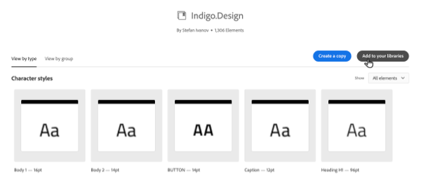
DOCUMENT ASSETSand select Indigo.Design underLIBRARIES. You should be able to see all the styles and components among which are:Colorscontaining palettes and special colors.Character Stylescontaining typographies for headings, subtitles, body and other texts.Componentscontaining 4 groups prefixed with a 🎨 emoji, related to styling, followed by numerous components each in its own group, and last but not least you will find a few groups prefixed with a 🌆 emoji, with a couple of hundred patterns laid out from the components to streamline your app design process.
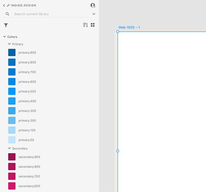
If this is the first time you are using styles and components in Adobe XD, you can switch between
LibrariesandLayersfrom the icon menu at the bottom left of the application.
2. Create an artboard.
Open Adobe XD and select an iPhone 12 Pro Max. This will give you a new file with one Artboard in the middle in portrait orientation (428x926). Lastly, from the panel on the right you may want to turn on the Responsive Resize option that will show you how the Artboard contents behave if it gets resized.
3. Add and customize components.
We will use the Libraries panel to add components from the Indigo Design Library. For some of them we will set appropriate States from the panel on the right, and apply Colors and Character Styles from the Libraries panel to customize their appearance. Everytime you create a new file, you have to open the Libraries panel and click on the back icon next to Document Assets to be able to select Indigo.Design and use it as a library.
Warning
Symbols and components designated as _Overrides must not be inserted on artboards as they provide component states and do not represent a complete component by itself.
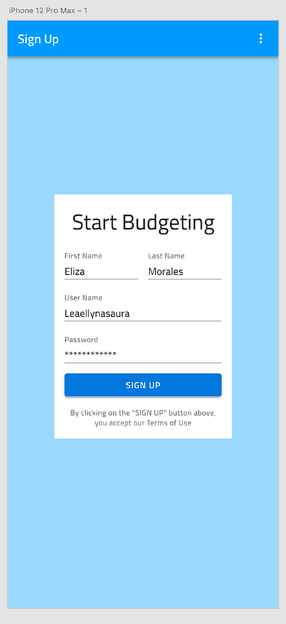
These are the steps to recreate the screen in the example.
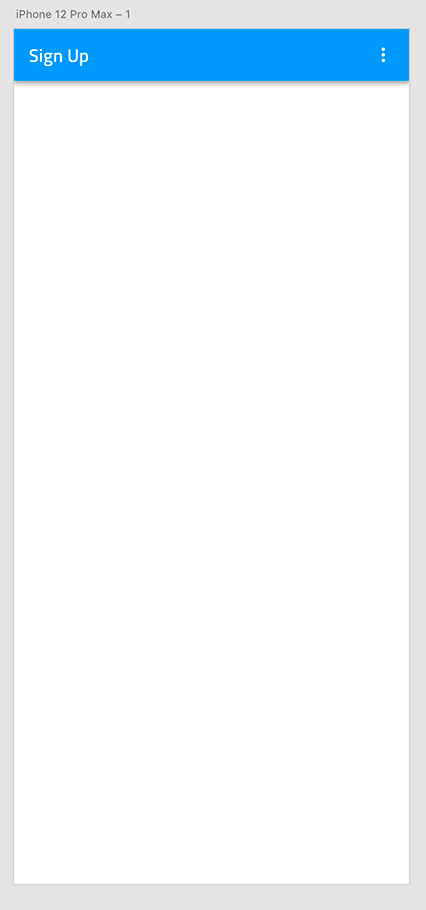
Add the Navbar.
- Use the searchbox in the
Librariespanel to find the Elevated variant of the Navbar. - Place it at the top of the artboard and stretch it to take up all the width available.
- Now switch the left panel to show
Layersand expand the component by clicking on the link icon to the left of its layer name. - Under Left Group there is another group called Left Action which we will delete and we will do the same for 1 | Icon, 2 | Icon, and 3 | Icon under Right Group.
- Select the Title, hit enter and type in "Sign Up".
- Use the searchbox in the
Add the background color.
Press theRkey and drag а rectangular shape, making sure it's sized accordingly to fill the available area below the Navbar and is also under it as a layer. With the rectangle selected change the left panel to showLibrariesand click the primary.100 color. You will notice that the default outline is still there so we need to untick theBorderunderAppearancein the panel on the right.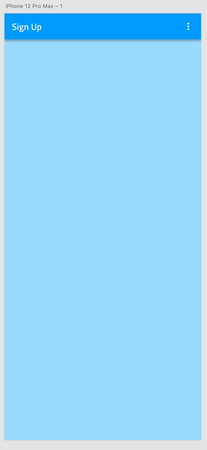
Add the background for the form.
- Press the
Rkey again and drag а rectangular shape with size 280x385. - Remove the border color like we did before and position it in the center of the artboard.
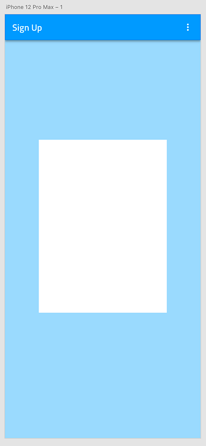
- Press the
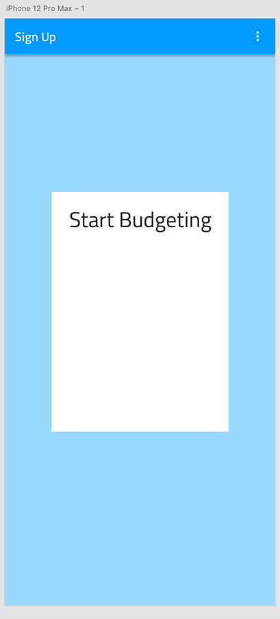
Add the title of the form.
- Press the
Tkey to add a text element on top of the white rectangle and type "Start Budgeting" in it. - With the text layer selected scroll down in the
Librariespanel to theCharacter Stylesand click on Heading H4 - 34pt. - Place it at the top of the white rectangle, with 16px spacing on the top.
- Press the
Add the inputs for first and last name.
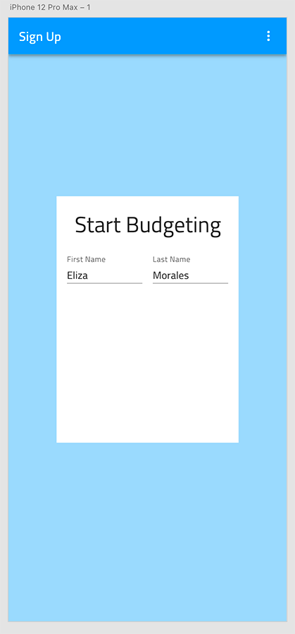
- Use the searchbox to find the Simple / Line / Enabled variant of the Input. Drag it below the form title, we just created, making sure you pick the right component, not the one prefixed with _Overrides!
- From the
Component (Instance)section in the right panel select Filled State. - Expand the layer like we did for the Navbar and delete the Prefix Container and the Suffix Container.
- Set the Label to "First Name", and the Value to "Eliza".
- Place it below the title. Leave 16px on the left and top.
- Set its width to 116px.
- Duplicate this input.
- Place the new one to the right of the first one, with 16px spacing between the two.
- Set its Label to "Last Name", and Value to "Morales".
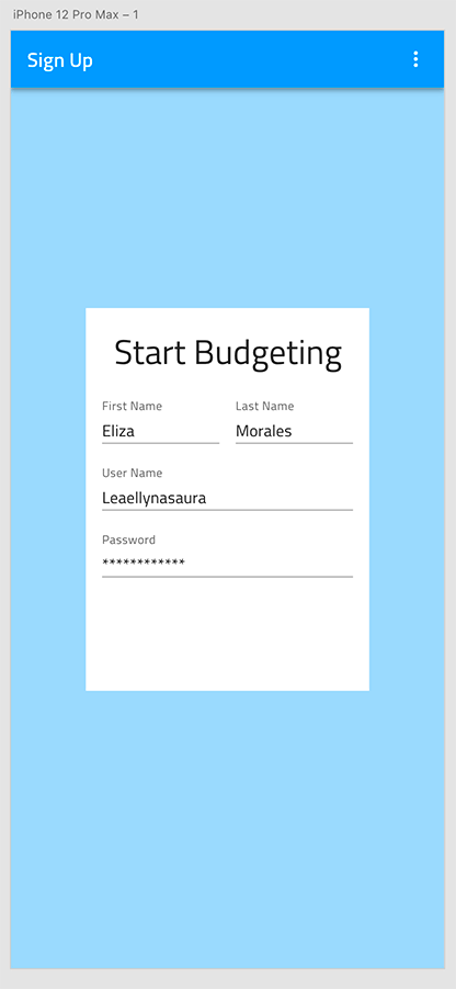
Add the inputs for user name and password.
- Duplicate one of the Name inputs twice to create two more inputs for Username and Password.
- Place them one under the other with a vertical spacing of 16px between each other and to the ones from the previous step.
- Stretch them across the full width with 16px spacing on both sides.
- Set their Labels to "Username" and "Password" and their Values to "Leaellynasaura" and "************".
- Select the hidden ContentType layer of the Password input and change its state to Password.
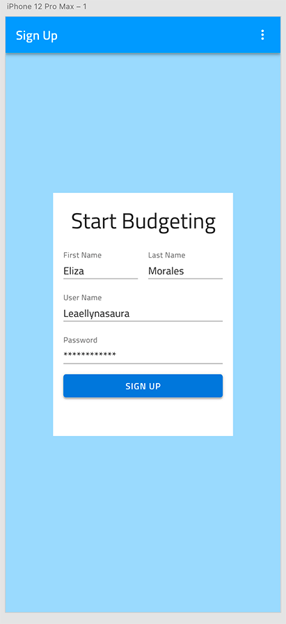
Add the sign up button.
- Change the left panel to
Librariesand look for a Contained Button. - Drag it below the inputs, making sure you pick the right component, not the one prefixed with _Overrides, and stretch it across the full width leaving 16px on the left, right, and from the inputs above.
- Switching back to
Layers, expand the component, delete its icon and set the Label to "SIGN UP". - Select the Group wrapping the Label and position it in the middle of the Button.
- Switch again to
Librariesto give the label a surface color and set the Background to info color.
- Change the left panel to
Add the terms acceptance text.
- Press the
Tkey to add another text element below the button and type "By clicking on the "SIGN UP" button above, you accept our Terms of Use" in it. - Assign a Caption - 12pt Character Style to it and give it a grays.700 Color.
- From the right panel set the Text to Auto Height and change the layer size so that there is a 16px spacing on the left, right and above.
- Press the
Make the artboard responsive.
Select the text layers, inputs, button and white rectangle, and group them. The automatic Responsive Layout for this group is enough to assure the expected responsive design behavior.
Additional Resources
Related topics:
Our community is active and always welcoming to new ideas.
 GitHub